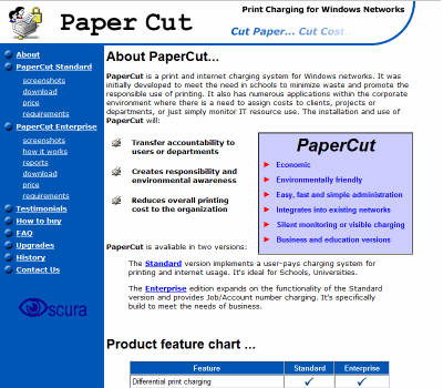
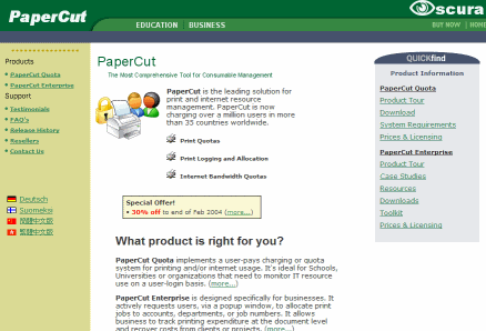
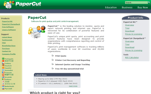
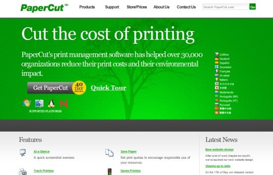
For the past month Tom and I have been quietly working away on our new website. It was satisfying to push it live today (Sunday night US time). The new site is quite a change for us. It’s the first time we’ve used an external designer. Here are a few screen-shots showing how our site has evolved over the last ten years:
PaperCut Circa 2000
PaperCut Circa 2004
PaperCut Circa 2009
PaperCut Circa 2010 (Today)
Historically all our web design has been done in-house. As a bunch of computer programmers we are very proficient in HTML, CSS, and JavaScript, however when it comes to artistic flair we finally conceded that we were hitting our limits. It was time for some outside help! After some searching we found a web designer ( Pollenizer ) we felt was able extend our own culture and style rather than impose their own.
I see that the Internet has two quite different styles:
1. The “Corporate Look” - conservative sites painted with fancy stock images (often from istockphoto.com ). If we were to adopt this style I suppose we’d have some attractively dressed person standing smiling next to a printer :-) )2. The “Web 2.0 Look” - punchy colors, wide open spaces, and a focus on content / message rather than visual gloss - like YouTube, Twitter, and Facebook.
As PaperCut has grown over the years, we’ve expanded from being a solution exclusively for education to one focused on all areas from schools, to SME, to large business. Increasingly PaperCut is presented at management-level in corporate organizations. Despite this “enterprise shift”, we still felt that the Web 2.0 look better fitted with our technical-focused culture. We felt it was important to have a website that reflects who we are and the way we work. We’re quite proud that we’re an engineering driven organization run by young developers and want to make this clear through our website.
The visual design of the new website was done by one of the lead web designers behind Kazaa - in its day one of the Internet’s most popular sites (and one that will undoubtedly also go down in history for notorious reasons!). He’s done lots of work with leading Web 2.0 companies and I think has done a great job for us. We hope you like the new design. We’ve kept with our green theme (in both color and environmental impact aspect), and also put more focus on our name rather than our starting-to-look-dated XP style icon.
At a technical level the site is also a departure from the norm. We’ve decided to cast away the shackles of IE6 (darn Microsoft!) and now target the last web technologies (It still “works” in IE6 but is not visually ideal). We’ve also making extensive use of CSS and JQuery . One of the design goals was to have the home page load as fast as our older site. We’ve come close to this with the help of a few tricks. For example you’ll notice the progressive image loading on the home page - the content renders really quickly, while the glowing tree loads in later in the background (this tree constitutes about half of the page download and is done last and faded in with a JQuery effect ). Some other technical highlights include:
- Designed for larger screens (not many system administrators are running 1024 monitors on their desktop these days!)
- Leverages CSS font kerning and shadow
- Enabled GZip server-side compression on selected resources. e.g. compress our CSS and Javascript files. (If this works well we’ll consider enabling on other resource types.)
- We’ve used cutting-edge CSS styling attributes available in Firefox and Webkit based browsers such as rounded corners on DIV elements (emulated in IE using curvycorners.js )
- JQuery is downloaded off GoogleAPI’s CDN . Many sites are now using this so these resources are already in people’s local cache.
- Some Apache .htaccess tweaks to more effectively leverage local browser caching.
- Renders on the iPad and iPhone!
Hope you all enjoy the behind the scenes story and welcome the new look! I should also mention that the blog/news section which you are reading now is not yet skinned in the new style!


