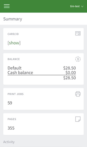
When the User web interface is accessed from a mobile browser (e.g. Mobile Safari from an iPhone, or Chrome on an Android phone), the user is presented with a lightweight interface that is optimized for smaller screen sizes.
Want to know more about those config keys?
- Setting the
user.web.responsive-style.enabledkey toYenables the improved mobile layout when viewing the user web interface from a mobile device. This uses the same user web interface as the desktop mode, but applies more mobile-friendly styling to the mobile view, with readability and navigation improvements. - Setting the
user.web.mobile-summary.enabledkey toNdisables the original mobile experience pictured below in the left hand column. After logging in, a user will be taken straight to the user web interface. If you leave this key set to Y, users will see the original mobile experience summary page after logging in - they can then click ‘View in desktop mode’ to view the user web interface. To avoid the extra click for your users, set this key to N.
New mobile experience (since 24.1.3) | Original mobile experience |
|---|---|
|
|
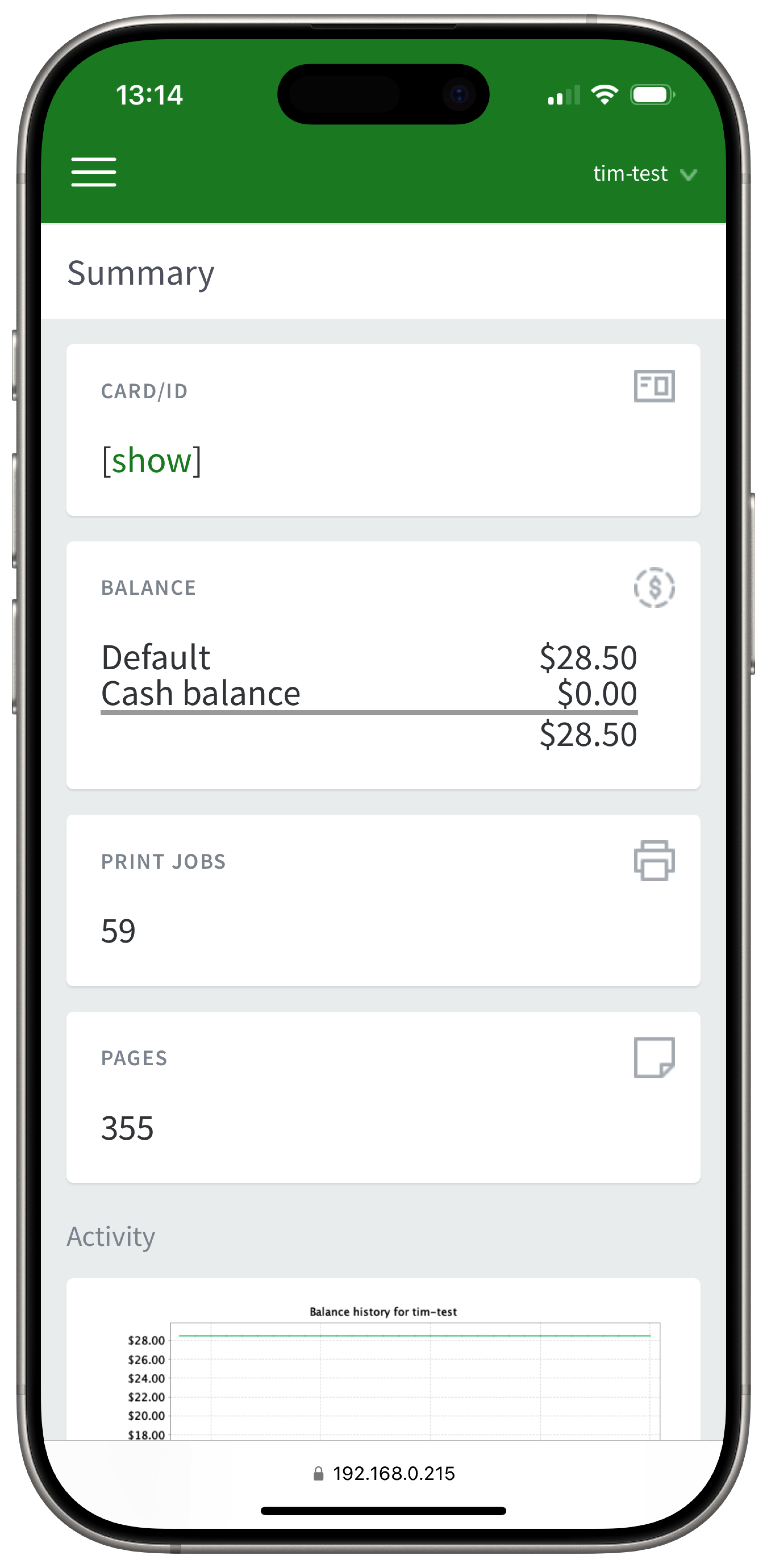

New mobile experience screenshots (24.1.3 and later)
The summary screen:
The user can click the menu icon to access the full navigation menu:
Features available in the mobile user web pages include:
User Transaction History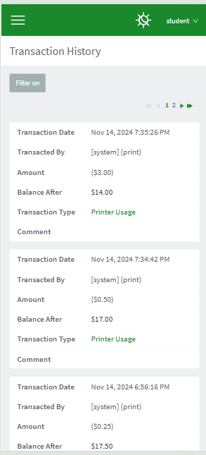
Recent Print Jobs
Note: in this new mobile experience, all other functions which are available in the full desktop user web interface are also available in the mobile experience.
Original mobile experience screenshots
The summary screen:

The user can view the user web pages in desktop mode instead by clicking View in Desktop mode:
Features available in the mobile user web pages include:
Checking user balance:
Viewing environmental impact statistics
Redeeming a TopUp/Pre-Paid Card

Note: other functions are not available in this simplified version of the mobile interface.
Comments